
DIY Color Capping Ceiling Ideas (2026 Trend Guide)
400 views
That ceiling is probably the most ignored surface in your room.
Walls get the paint samples. Cabinets get the attention. Floors get carefully chosen rugs. Then the ceiling gets another coat of plain white and disappears.
Color capping flips that habit.
The 2026 version isn't simply “paint the ceiling a bold color.” The idea is more controlled: build a tonal progression from the walls upward, then let the ceiling act as the deepest or most concentrated shade. The result can feel surprisingly architectural without adding expensive millwork.
And yes, you can DIY it.
What exactly is color capping?
Color capping is a layered paint treatment that uses several related shades from the same color family across the walls, trim or architectural details, and ceiling. The darkest tone typically sits at the top, creating a visual “cap” over the room.
The technique gained attention as a named 2026 interior trend after Benjamin Moore introduced the concept through its 2025 Autumn/Winter design direction, with the approach subsequently highlighted by design publications.
Think of it as a gentler cousin of color drenching.
With classic color drenching, the walls, trim, doors and ceiling may all use essentially the same color. Color capping introduces hierarchy. Your eye notices the gradual shift rather than hitting one abrupt ceiling-versus-wall contrast.
That distinction matters.
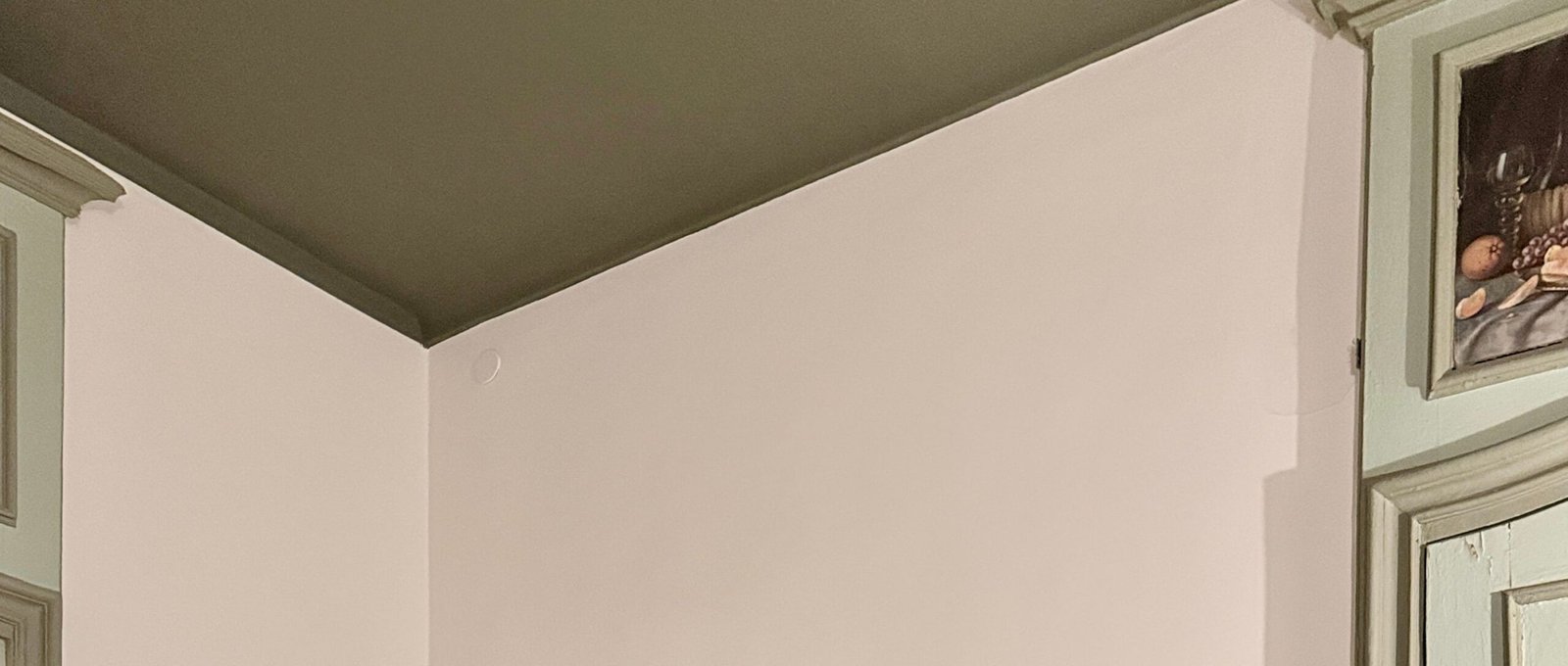
A room with pale sage walls, medium olive trim and a deeper olive ceiling feels layered. The same room with sage walls and a random navy ceiling is simply two colors competing for attention.
The easiest 2026 formula: light, middle, dark
You don't need an interior designer's color chart.
Start with one paint family and choose three shades that are visibly related.
Lightest: walls
Middle: trim, doors, molding or selected architectural details
Darkest: ceiling
Benjamin Moore currently recommends considering ceiling colors that are darker or more saturated than the walls for a dramatic effect, while also noting that matching walls and ceilings can create a cohesive monochromatic treatment.
A practical rule is to move roughly two or three positions along a paint strip between major surfaces rather than choosing nearly identical colors. You want the progression to be noticeable from across the room, but not so extreme that it looks like three unrelated paint jobs.
Three combinations worth trying
Style | Walls | Trim / Details | Ceiling |
|---|---|---|---|
Soft olive | Pale sage | Muted olive | Deep olive |
Warm neutral | Creamy beige | Camel/taupe | Chocolate brown |
Dusty blue | Misty blue | Muted denim | Deep blue-gray |
For 2026, warmer browns, olive tones, earthy shades and richer colors are particularly compatible with the broader move away from sterile all-white interiors. Architectural Digest's color trend reporting has also pointed toward earthy shades and more expressive use of color.
Don't feel obligated to choose something dramatic, though. A pale blue wall with a slightly deeper blue ceiling can still qualify as color capping.
Small rooms can actually benefit from it
Here's the part that sounds backward.
A darker ceiling doesn't automatically make every room feel smaller.
The effect depends on the ceiling height, lighting, surrounding colors and how abruptly the ceiling meets the walls. Designers increasingly use continuous or related wall-and-ceiling colors to reduce visual boundaries, particularly in compact rooms.
A tiny powder room is a particularly good testing ground.
Try warm beige walls, a medium mushroom-colored trim, and a muted brown ceiling. Add a brass mirror and warm lighting. Suddenly, the ceiling feels intentional rather than like an unfinished patch of drywall.
For a bedroom, dusty blue or deep green can create a cocooning effect.
For a narrow hallway, I'd be more cautious with very dark ceilings. The lack of daylight can make the space feel compressed.
Want the look without painting everything?
There's a clever shortcut.
Keep your existing wall color and introduce the “cap” only through the upper portion of the room.
For example, imagine white walls with a warm terracotta band running around the upper wall and continuing onto the ceiling. The color becomes an architectural border rather than a full-room treatment.
Another option is to paint only the ceiling and crown molding in a deeper version of the wall color.
This works especially well when you already have decorative molding. The existing architectural line tells you exactly where the color should change, so you aren't trying to invent a boundary with painter's tape.
No crown molding?
You can still create one.
A narrow painted band—roughly 2 to 6 inches below the ceiling—can establish a transition. Just measure carefully. A slightly crooked line becomes painfully obvious once the paint dries.
How to choose colors without regretting them
Paint samples are not optional here.
Ceiling color is heavily affected by light. Benjamin Moore specifically recommends sampling colors because the apparent color can change with lighting and room orientation.
Put your samples on both the wall and ceiling if possible.
Then look at them in the morning.
Check again around noon.
Check after the lamps are switched on at night.
That dusty green that looked sophisticated at 2 p.m. can suddenly look gray beside a cool LED bulb.
A north-facing room can also behave very differently from a sun-filled south-facing room. Your flooring matters too. Warm wood can push cool paint toward a different visual temperature.
One more trick: don't judge the ceiling shade from a tiny paint chip held at eye level. Paint a large sample board or a substantial test area and stand several feet away.
The ceiling is viewed from a distance. Test it that way.
DIY painting order matters
This is where a beautiful idea can become an annoying weekend.
If you're painting the whole room, start with the ceiling. You're going to get some drips.
That's fine.
Paint the ceiling first, then walls, then trim and other detail work. Benjamin Moore's basic ceiling-painting guidance recommends cutting in around the perimeter with a brush before rolling the main ceiling surface.
For a color-capping project, I'd use this sequence:
Repair and clean the ceiling. Fill nail holes, sand rough patches and remove dust.
Paint the darkest ceiling shade. Cut in carefully around the perimeter, then roll in manageable sections.
Allow it to dry completely. Don't judge the final color while it's still wet.
Paint the middle tone on trim or architectural details.
Finish the walls with the lightest shade.
Remove painter's tape carefully. Pull it while the final coat is set but not excessively hardened.
Use a quality extension pole for the roller. Your neck will thank you.
And don't overload the roller. A dripping ceiling creates little splatters everywhere, including on surfaces you thought were safely covered.
Flat ceiling paint is usually the safest choice
Ceilings expose imperfections mercilessly.
Every drywall seam, roller mark and tiny patch can become visible when light hits it from a window.
That's why flat or ultra-flat finishes remain the conventional choice for ceilings. Benjamin Moore describes flat ceiling finishes as particularly forgiving because they minimize reflection and help create a uniform surface.
You can experiment with sheen, but I'd save glossy ceilings for rooms where you're deliberately pursuing a more theatrical finish.
There's a practical reason, too: higher sheen reflects more light and can reveal surface flaws that flat paint quietly hides.
Sherwin-Williams likewise recommends maintaining a consistent sheen when using related colors across walls and ceilings.
Try the “same color, different depth” version
If three separate colors feel too complicated, simplify.
Choose one color family and use lighter and darker variations of it.
A soft green wall can transition into a deeper green ceiling while the trim sits somewhere between the two.
This approach feels especially natural in rooms with lots of wood, linen, woven materials or vintage furniture. The paint doesn't have to fight the furniture.
It frames it.
Benjamin Moore's current ceiling guidance includes monochromatic treatments in colors such as Savannah Green, Hale Navy and Pashmina, illustrating how a single color family can be carried through walls and ceilings for a more enveloping effect.
Five color-capping ideas for different rooms
1. Cozy bedroom: dusty blue + deep blue-gray
Use a muted blue on the walls, a slightly stronger blue on trim, and a deep blue-gray overhead.
Keep bedding light.
Add warm bedside lamps rather than relying entirely on cool white bulbs. The ceiling becomes dramatic at night without turning the room into a cave.
2. Living room: warm cream + caramel + brown
This is the safer option for people nervous about colorful ceilings.
Cream walls.
Caramel-toned architectural details.
A restrained chocolate or coffee-colored ceiling.
It works beautifully with oak, walnut, leather and woven textures.
3. Home office: pale olive + olive + forest
Green is particularly effective for this technique because the shades naturally sit close together.
Use pale olive on the walls, medium olive on trim and a deeper forest green above.
Keep the desk and shelving relatively simple so the ceiling remains part of the visual composition rather than competing with everything else.
4. Powder room: terracotta + rust + deep clay
Go bolder here.
Small rooms tolerate stronger color surprisingly well because they're already intimate spaces. A deep clay ceiling paired with terracotta walls can make inexpensive fixtures and simple mirrors feel much more deliberate.
5. Dining room: soft beige + taupe + oxblood
This one is for the adventurous homeowner.
Keep the walls restrained and let the ceiling carry the drama. An oxblood-toned ceiling can look striking with warm wood and aged brass, but test it first—especially if the room has limited daylight.
Common mistakes that ruin the effect
The biggest mistake is choosing three colors that aren't actually related.
They may each look great individually. Together? Not so much.
Another problem is ignoring the light fixture. A large black pendant under a dark ceiling can visually merge into the background. Sometimes that's beautiful; sometimes it makes the fixture disappear.
Then there's the tape problem.
If the ceiling line is uneven, color capping highlights it. Use a sharp brush and take your time around corners. On textured walls, perfectly crisp tape lines can also be difficult, so consider using the existing architectural break instead.
Finally, don't automatically assume darker means better.
The 2026 conversation around color is broader than simply painting everything dark. Recent design coverage is also highlighting “soft contrast”—layered, related colors that create depth without overwhelming the room.
That's good news for DIY decorators.
You don't have to repaint your entire personality onto the ceiling.
Color capping vs. color drenching
The two are related, but they're not identical.
Color drenching usually pushes one dominant color across walls, trim, doors and ceiling. The room becomes an immersive color field.
Color capping creates a tonal ladder. The ceiling gets its own deeper shade, while the walls and architectural elements transition gradually toward it.
If you're nervous about going fully monochromatic, color capping is the easier first experiment.
It gives the ceiling personality without making every surface equally loud.
DIY Color Capping FAQs
Is color capping the same as painting the ceiling a darker color?
Not exactly. A darker ceiling by itself is simply a contrasting ceiling treatment. Color capping usually involves a coordinated progression of related shades across the walls, trim or architectural details, and ceiling.
What is the best ceiling finish for color capping?
Flat or ultra-flat paint is the safest choice because it reduces reflections and hides minor surface imperfections. Higher sheens can work, but they require a much smoother ceiling.
Will a dark ceiling make my room look smaller?
It can, particularly in a small, poorly lit room. But the effect isn't universal. Using related wall and ceiling colors can actually reduce the hard visual boundary between surfaces and make the architecture feel more unified.
How many colors should I use?
Three shades are a strong starting point: light on the walls, medium on trim or architectural details, and dark on the ceiling. For a simpler project, two related shades can produce a similar effect.
Can I try color capping without repainting the whole room?
Absolutely. Paint the ceiling and existing trim in related deeper tones while leaving the walls intact, or introduce a painted band near the ceiling. Just make sure the new colors connect visually with your existing furniture, flooring and wall color.
Give the fifth wall a real job
The best color-capping projects don't feel like a trend was pasted onto a room.
They feel planned.
Start with the room you already have. Look at its daylight, flooring, furniture and architectural lines. Pick one color family, test large samples, and let the ceiling move a little deeper than the walls.
Then stop.
You don't need ten colors. You don't need expensive molding. You don't even need a dramatic shade.
A well-chosen ceiling can be enough to make an ordinary room feel finished—and in 2026, that's one of the simplest ways to make the fifth wall finally earn its place.
DIY color capping ceiling
ceiling paint ideas
2026 ceiling trends
room ceiling design
modern ceiling colors
Found this helpful? Share it!